


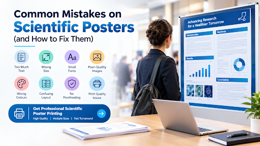
Scientific posters help researchers share their findings at conferences, academic events, and university presentations. A well-designed poster makes complex information easier to understand and encourages people to learn more about your work. However, even strong research can lose its impact when the poster contains design errors, unclear text, or poor-quality printing.
Planning your layout and choosing professional scientific poster printing can make a real difference in how your research is presented. From selecting the correct paper size to checking images and charts, small details can affect the final result. This guide covers common scientific poster mistakes and practical ways to avoid them.
1. Using Too Much Text
One of the most common mistakes is trying to include every detail of a research paper. Large blocks of text make posters difficult to scan, especially when visitors are standing a few feet away.
How to fix it:
- Keep paragraphs short and focused.
- Use bullet points for key findings.
- Highlight important results and conclusions.
- Remove background details that are not essential.
Your poster should encourage discussion rather than replace your full research paper. Include only the information readers need to understand your study.
2. Choosing the Wrong Poster Size
Selecting an unsuitable size can create problems with spacing, readability, and conference display requirements. A poster that is too small may feel crowded, while an oversized design might not fit the allocated display area.
The A2 size measures 420 × 594 mm and can work well for compact research summaries, classroom presentations, and smaller academic displays. However, many scientific conferences require larger formats, such as A1 or A0.
How to fix it:
- Check the conference’s poster size requirements before designing.
- Measure the available display space.
- Choose a format that provides enough room for charts, images, and text.
- Confirm the final document dimensions before printing.
Choosing the correct size early helps prevent costly changes and ensures your poster fits its intended setting.
3. Using Fonts That Are Too Small
Small text may look acceptable on a computer screen but become difficult to read when printed. Conference visitors should not have to stand extremely close to understand your research.
How to fix it:
Use a clear font and create a strong size difference between headings, body text, and captions. As a general starting point, use headings around 36–48 points and body text around 24–32 points for larger posters. Adjust these sizes according to the final print dimensions and viewing distance.
Before ordering scientific poster printing, review the document at its actual size or print a small sample of important sections. Check that labels, references, and chart legends remain readable.
4. Using Poor-Quality Images and Charts
Blurry photographs, pixelated diagrams, and unclear graphs can reduce the quality of an otherwise strong poster. These problems often appear when low-resolution images are enlarged to fit the layout.
How to fix it:
- Use high-resolution images suitable for the final print size.
- Export charts directly from your data or plotting software.
- Prefer vector graphics for diagrams and illustrations when possible.
- Check image quality before sending your file to the printer.
Make sure every figure has a clear label and explains something important about your research. Avoid decorative images that do not add useful information.
5. Choosing the Wrong Colours
Too many colours can make a scientific poster look confusing. Poor contrast can also make text difficult to read, particularly under bright conference lighting.
How to fix it:
Choose two or three main colours and use them consistently. Dark text on a light background is often easy to read, while a limited accent colour can highlight key findings. Avoid placing similar colours next to each other when they reduce contrast.
Check that charts remain understandable for readers with colour-vision deficiencies. Whenever possible, use labels, patterns, or different line styles alongside colour to distinguish data.
6. Creating a Confusing Layout
A poster should guide readers naturally from the research question to the results and conclusion. When sections are scattered or headings are unclear, visitors may struggle to follow the main message.
How to fix it:
Arrange the content in a logical reading order. A common structure includes:
- Title and author information
- Introduction and research objectives
- Methods and materials
- Results and discussion
- Conclusion and key findings
- References and acknowledgements
Use consistent spacing and clear headings to separate sections. Leave enough white space around text and figures so the design does not feel crowded.
7. Forgetting to Proofread
Spelling mistakes, incorrect figures, and inconsistent labels can affect the credibility of your work. Even a small error in a measurement or chart caption may confuse readers.
How to fix it:
Proofread the poster carefully before printing. Check names, affiliations, units, references, statistical values, and figure numbers. Ask a colleague to review the content because another person may notice errors you have missed.
Also, confirm that the final file contains the correct version of your research. Making corrections before printing is easier than replacing an entire poster later.
8. Ignoring Print Quality and Finishing
A strong digital design can still produce disappointing results if the printed colours, paper, or finishing are unsuitable. Incorrect dimensions, missing fonts, and poorly prepared files may cause problems during production.
Professional scientific poster printing helps researchers prepare a clear, high-quality presentation for academic events. However, you should still check the file and communicate your requirements before placing an order.
How to fix it:
- Export the poster as a print-ready PDF when required.
- Confirm the page dimensions and image resolution.
- Check whether fonts are embedded.
- Ask about suitable paper and finishing options.
- Allow enough time for printing, collection, or delivery.
If you have a conference deadline approaching, consider next-day poster printing where available. Submit the final approved file early enough to allow for production and delivery delays.
9. Leaving the Final Check Until the Last Minute
Rushing can lead to missing sections, incorrect dimensions, and avoidable printing errors. Last-minute changes can also introduce mistakes that were not present in the original design.
How to fix it:
Create a simple checklist before sending your poster to print:
- Confirm the conference specifications.
- Check the title, author names, and research findings.
- Review text size, images, and charts.
- Verify the final page dimensions.
- Approve the print-ready file.
- Confirm the collection or delivery date.
Planning ahead gives you more time to correct problems and prepare for your presentation.
Conclusion
A successful scientific poster combines clear research, readable text, organised sections, and high-quality printing. Avoiding common mistakes such as overcrowded layouts, poor images, weak colour contrast, and incorrect sizing can help your work stand out at academic events.
Before ordering scientific poster printing, check your conference requirements and review the final design carefully. Whether you need a compact A2 size poster or a larger conference display, choosing the right format and print quality will help you present your findings with confidence. Professional printing can also save time when you need a polished poster for an important research deadline.
